TIPS & TRICKS
13 Interactive Direct Mail Ideas
Taken straight from the Who’s Mailing What! Collection, here are 13 interactive direct mail ideas to help inspire your work.
To increase the power of your campaign to sell, consider using interactive direct mail. Unlike most mailings that consumers and businesses receive and consider, interactive direct mail pieces can’t easily be dismissed with a single glance or quick scan. Instead of passivity, these campaigns invite – to one degree or another – that the recipient take some physical action.
Consider what you need to do to stand out from the competition. At a basic level, you need your direct mail copy (and images) to follow the Attention / Interest / Desire / Action (AIDA) model.
Your direct mail needs to step up so that your customer can straighten up and really look at it and your message. It needs to interrupt their other thoughts and concerns and engage their senses besides sight, such as touch. After all, direct mail is a physical medium. It’s ink, printed on paper, with finishes, embellishments, and all kinds of flourishes that are possible to create a different kind of tangible experience for the recipient. To avoid the recycling basket, your campaign should consider interactive direct mail tactics as part of its strategy.
Taken straight from the files of Who’s Mailing What!, here are interactive direct mail ideas to help inspire your work.
1. Giant Sticker
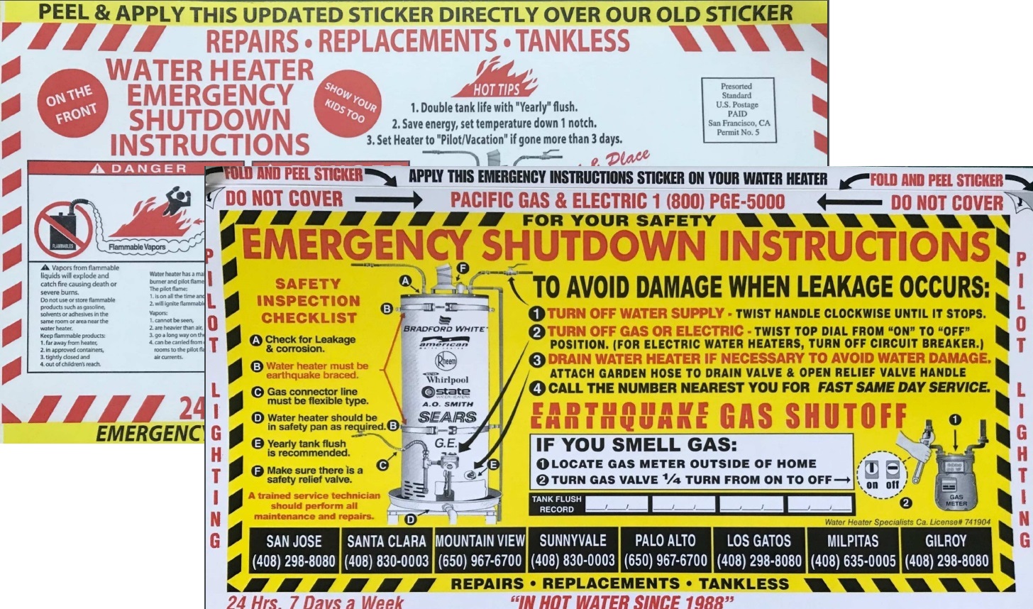
There are interactive direct mail stickers that can be used to respond to an offer, and then there are stickers that can only be used under unusual and perhaps dire circumstances. California utility Pacific Gas & Electric mails a 6”x11” sticker that gets to work when the prospect peels it off its backing – the address side – and applies to their water heater. That way, in case there’s an earthquake, they’ll know how to avoid danger, and who to call for repairs or service.
2. Wheel Chart
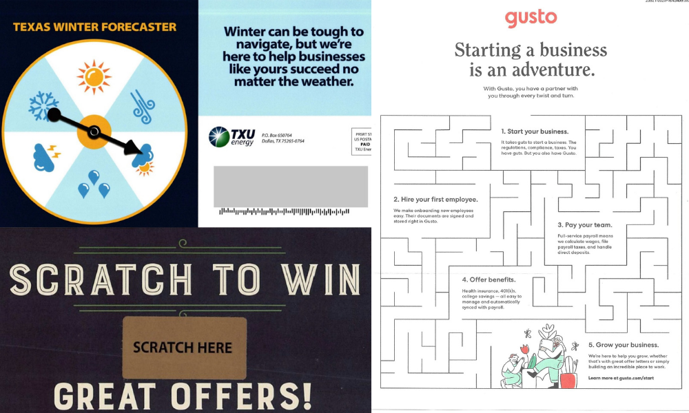
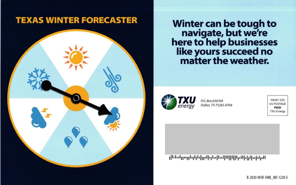
Customers of Texas utility TXU Energy know about unpredictable weather all too well after February’s winter snap. The spinner on this January 2021 mailing perfectly illustrates that point, and invites the recipient to give it a twirl. They get to think about weather’s unpredictability, and how they can prepare their business for it.
3. Ring Sizer
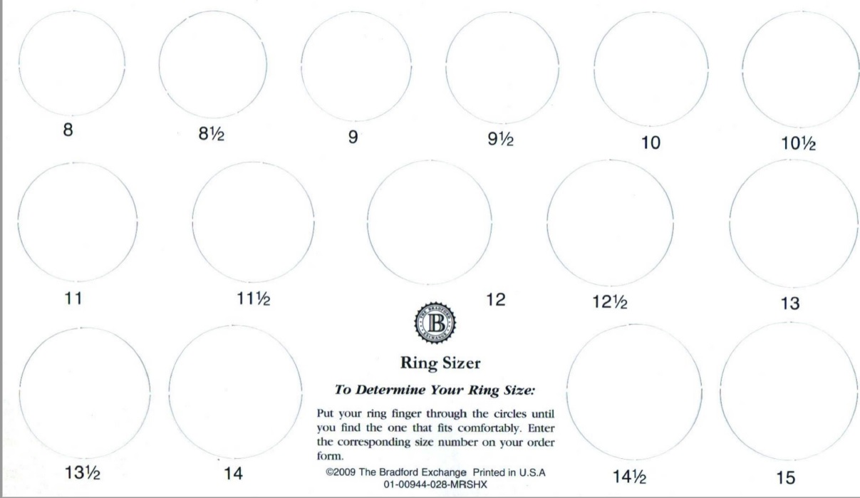
Do you know what size ring you wear? How about that special someone? If not, companies that sell jewelry have you covered. The ring sizer, printed on card stock, removes an obstacle blocking the order, as in this example from The Bradford Exchange promoting its USMC Tribute Ring.
4. Product Samples
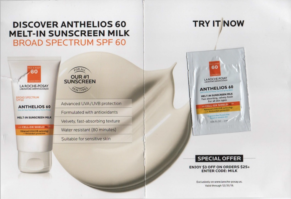
In so many product categories, there’s a lot of competition. To stand apart, food and cosmetics companies frequently mail samples, which removes price as a barrier. On this self-mailer, LaRoche-Posay includes a sample of its top-selling sunscreen. To further help convert the prospect into a customer, it also provides a discount code good on its website.
5. Lumpy Mail
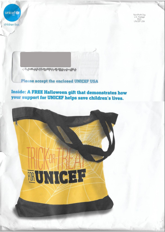
What is in that envelope? Even when you tell a recipient what’s inside — as UNICEF did with the enclosed tote bag — the mailing’s tactile quality gets your attention. It’s not flat or smooth; it feels lumpy or squishy, with something inside that shifts around when you flip it. It’s all about creating intrigue — a desire to rip it open and see it.
6. Quiz
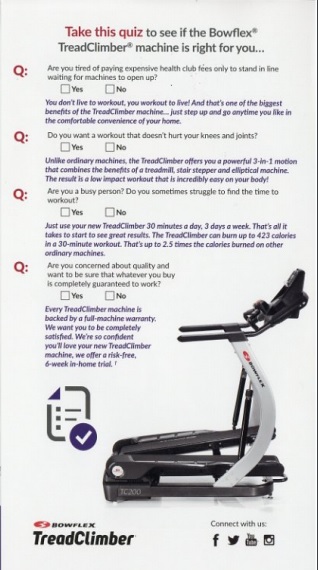
Sometimes sales copy, images, and charts can be intimidating or overwhelming. A customer may not know where to start or if the product or service will be right for them. This is where a quiz can come in handy. By answering a few questions, they can self-qualify – which is just what fitness equipment maker Bowflex was going for in this mailing.
7. Scratch-Off
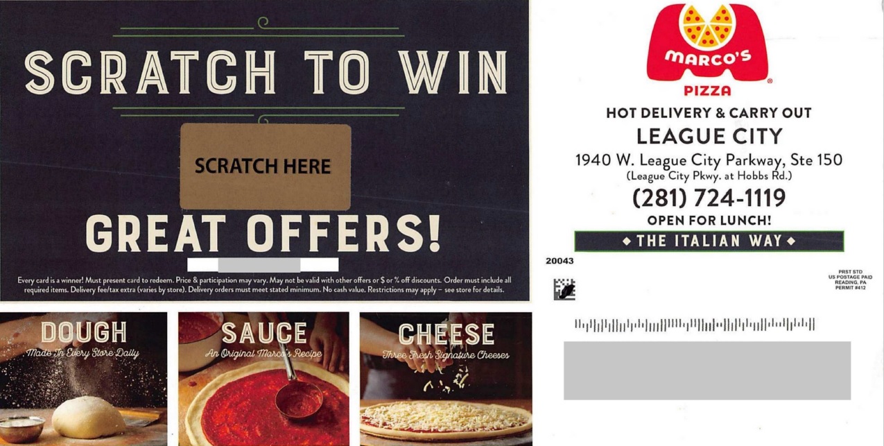
Most people like to win something with only minimal risk, and that applies to direct mail. Scratch-offs, like the one on this postcard from Marco’s Pizza, are tempting interactive direct mail pieces. They make your customer curious about what will be revealed: maybe a discount, or even a “free prize”.
8. Maze
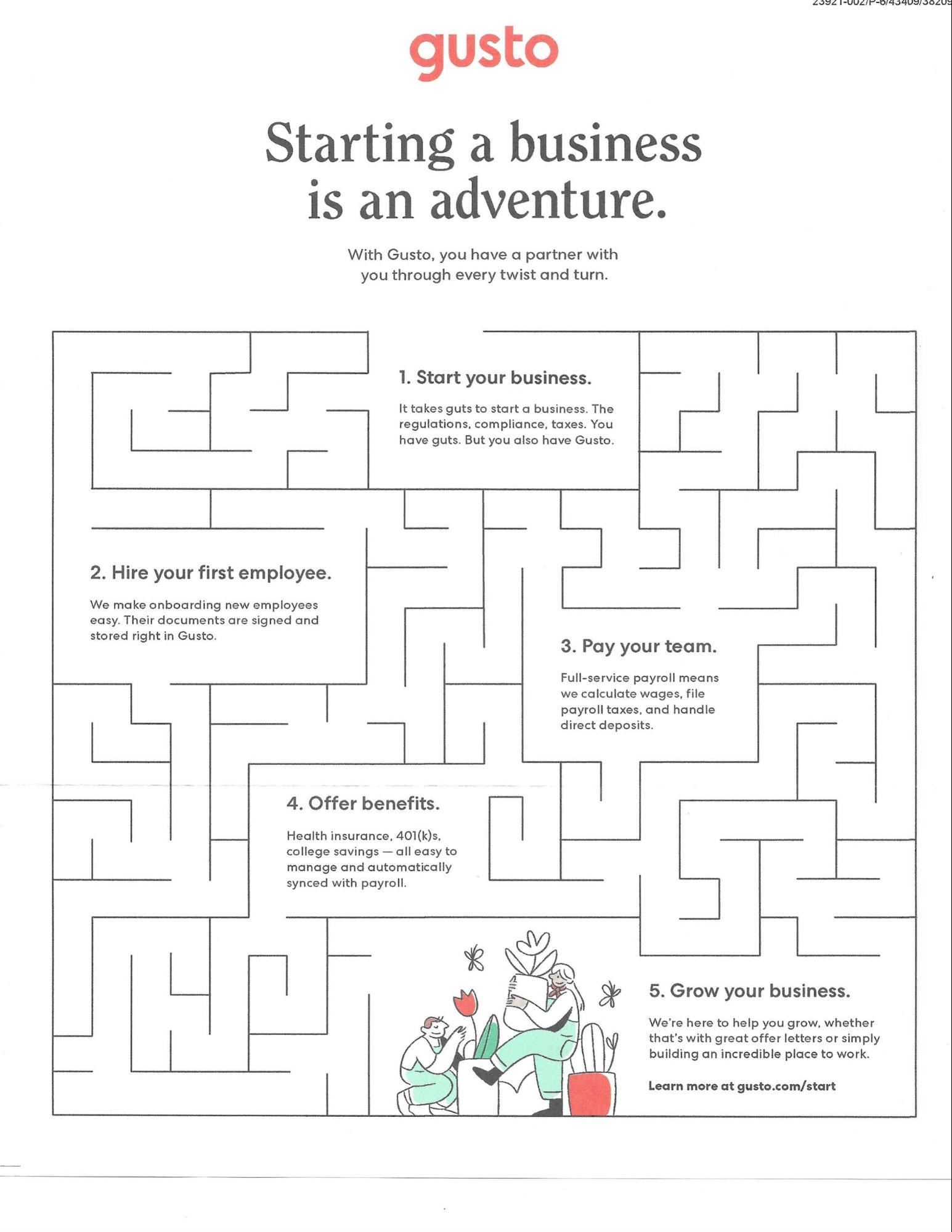
A good involvement gets your customer to think about your offer or your brand in a different way than sales copy does. Crossword and word search puzzles work well, as does this labyrinth in this March 2020 piece from HR benefits marketer Gusto. It helps to illustrate how the company helps clients grow.
9. Augmented Reality
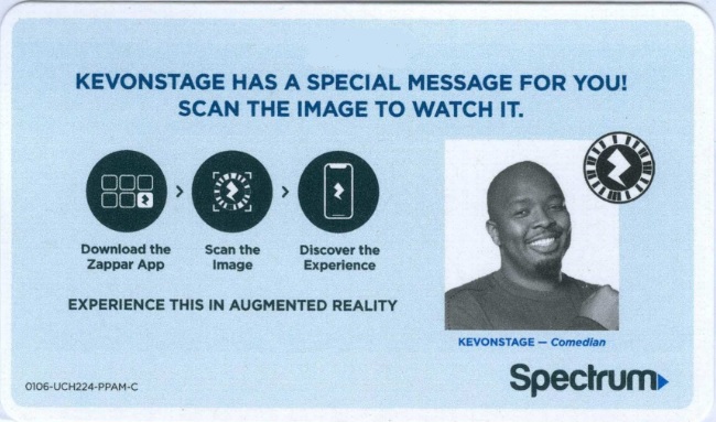
This is an interactive call-to-action that appeared in telecom provider Spectrum’s mail in 2020. The removable card on this mailer instructs the recipient to first download the Zappar app. Then, after opening it, scanning the logo starts playing a video from comedian KevOnStage promoting the company’s services.
10. Removable Card
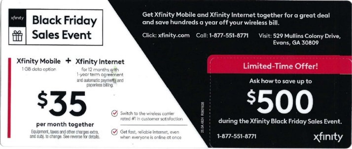
Direct mail for years has contained cards that are nearly impossible to ignore. Whether they’re spot-glued to a panel, made of plastic or paper, they compel action in different ways. This example from Comcast for its Xfinity service was mailed shortly before Black Friday in 2020. It’s made to be punched out from the rest of the heavy card stock and has just the right amount of offer information for the customer to act on.
11. 3D Glasses
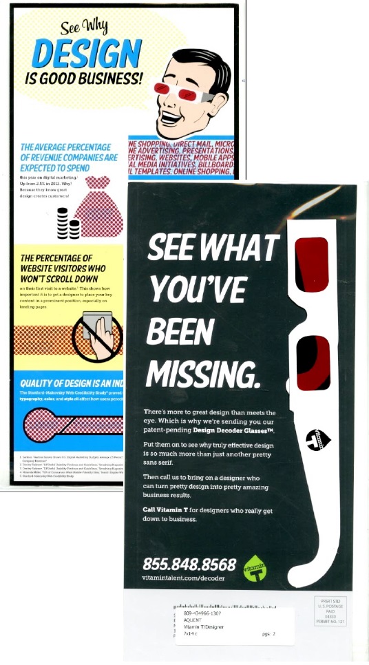
Vitamin T, a division of staffing agency Aquent, targets businesses seeking creative talent with a 14”x7” self-mailer. This interactive mail piece talks about problems related to poor online user experience. The statistics cited in the infographic are hidden, but can be revealed by the 3D glasses included in the poly-wrapped mailing.
12. Self-Test
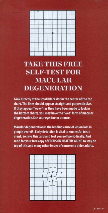
Let’s face it – everyone ages. But not everyone has the same challenges or questions about their health. The marketers behind the newsletter Focus on Healthy Aging get prospects to wonder about how they’re doing by including a simple eyesight test for macular degeneration on this insert in its subscription package.
13. Magnifying Glass
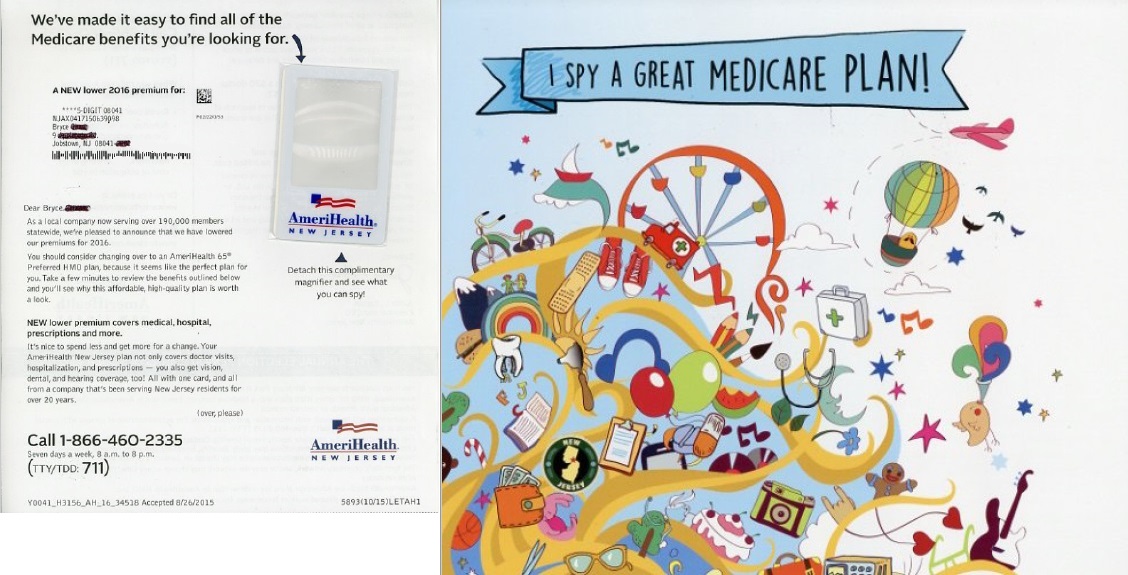
Speaking of vision, healthcare provider Amerihealth New Jersey reached out to prospects with an interactive mail piece that focused on the benefits of its Medicare plan. A magnifier was tipped to the letter, and an image for each benefit was hidden in the picture at right.
How to Search for Interactive Direct Mail on WMW!
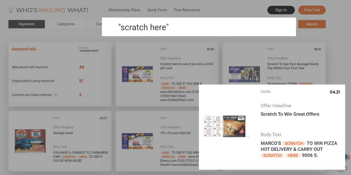
Here’s how you can perform an advanced-level search for specific involvement devices and interactive elements to help you boost response in your next mailing. In the main search box, use quotations around involvement device-related search terms to require these exact phrases in the mailing.
For example: “scratch-off” “QR code” “peel off” etc…
Use a Free Look Up tool to search for interactive direct mail examples.
Final Thoughts
The common denominator of all these interactive direct mail pieces is touch. Each one gets the prospect involved to the point where they physically spend more time with your mailer.
We know from multiple neuroscience studies that print engages people in a different way than online communications, leading to better brand recognition and brand recall. The U.S. Postal Service recognizes how direct mail can be a powerful tool to engage customers with special visual effects, sound, scent, taste, and tactile elements like papers, substrates, and inks. For USPS Marketing Mail that breaks new ground to reach audiences, its Tactile, Sensory, and Interactive Engagement Promotion provides a 2% discount on qualifying campaigns that register and mail through July 31.
Every moment that they spend with your message builds their interest, and increases their desire for the product or service. And this, in turn, improves the likelihood of making a sale.


