RESEARCH & REPORTS
15 Digital Companies Using Direct Mail Advertising
Here are 15 examples, all from our Who’s Mailing What! collection, of SaaS companies that create standout direct mail communications.
Direct mail has long been an important channel for traditional companies, but it turns out that it’s also vital in helping disruptors and top SaaS companies grow as well. Brands that use direct marketing — whether they make cars or sell services and products over the web — are proving that this is a vibrant medium.
With so many digital options, marketers want to grab consumers’ attention with mail, to stand out from their competition. In the debate of direct mail vs. internet marketing, it’s not easy to understand how to use direct mail marketing effectively without reviewing what some of the largest direct mail companies actually do to acquire new customers and keep current ones loyal.
Free Tool: Check 20,000+ companies using direct mail
What Companies Use Direct Mail?
Here are a few examples, all from our Who’s Mailing What! collection, of SaaS companies that create standout direct mail communications.
1. Google Direct Mail
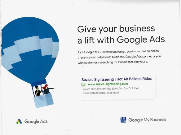
No list of SaaS companies is complete without mentioning Google. Mail has been a part of Google direct marketing for over 15 years, and it’s stayed remarkably consistent. The tech giant uses lots of white space, animportant direct mail practice. The piece shown below, mailed in February 2020, promotes its Google Ads service to B2B customers, by showing how Google ads look in the search results.
Looking back at older examples, we see the difference in design approach: Google was actively using people’s pictures on its mailed ads, like this one (below) from 2003, along with, some brighter colors as compared to the more minimalist approach now in 2020.

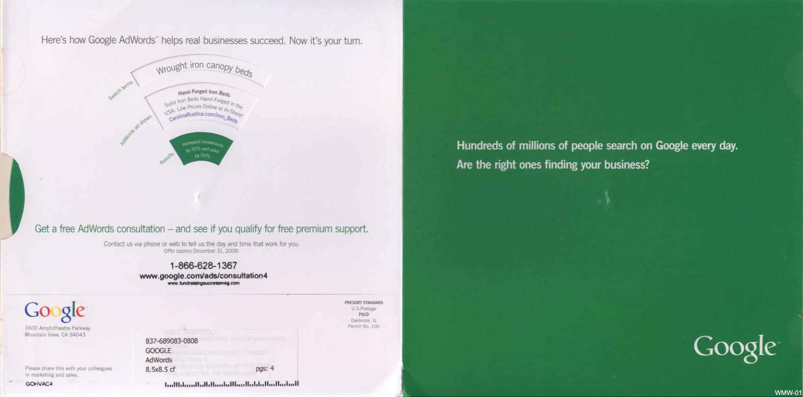
As for the minimalist design, in this 2008 mailing (below) for AdWords, Google stuck to simple colors and used a spinner wheel to talk about the benefits to the business of using AdWords.
2. Amazon Direct Mail
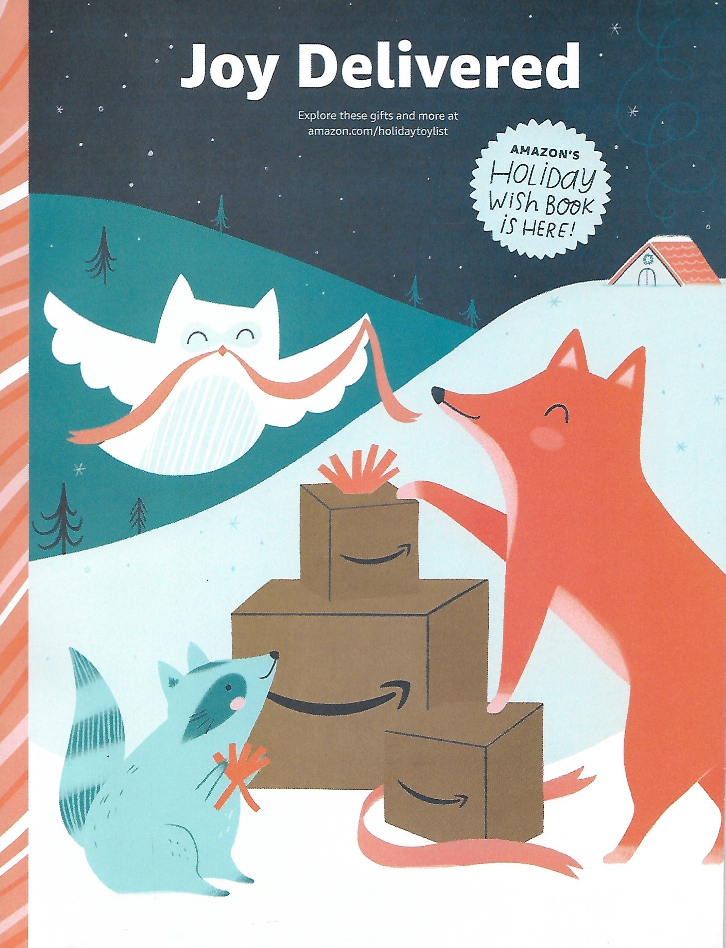
The retail giant — and tech revolutionary — sells millions of products as well as serves as a marketplace for many companies of all kinds. Amazon direct mail, though, carefully focuses on some key areas that build loyalty. For example, this year, it is mailing a holiday catalog (see below) that also includes fun activities for kids like puzzles, coloring pages, and stickers while also selling toys.
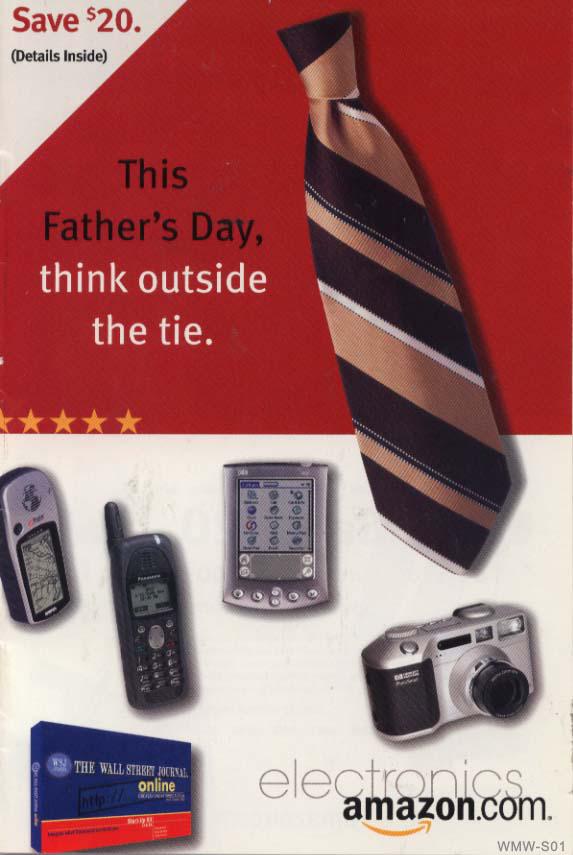
As you see, the design was quite different almost 20 years ago: in this folded self-mailer (below) from 2001 Amazon’s style consisted of bright colors and more real pictures of items instead of using drawn elements as they do now.
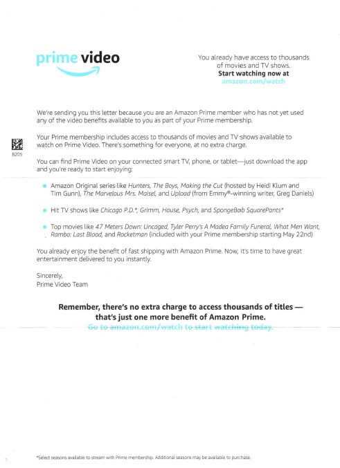
As for the video service, Amazon also reminds its Prime customers in this October 2020 effort (see below) that they are entitled to view movies, TV shows, and other content as part of their membership. With a simple nudge like this letter, they are more likely to stay happy and willing to remain in the fold.
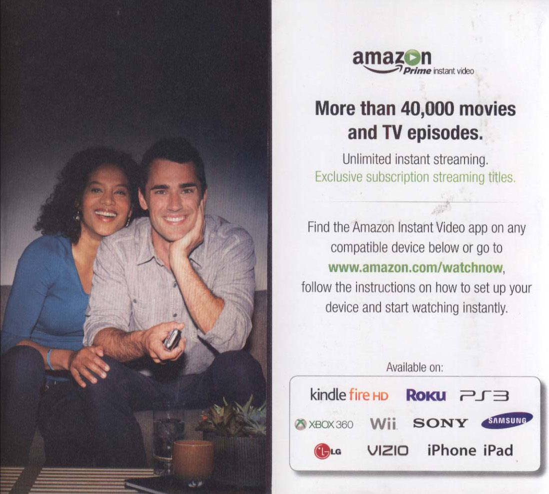
Speaking of video, this 2013 mailer promoting the Instant Video app to Prime members features a different logo, more colors, and photos of people.
3. Paycom Direct Mail
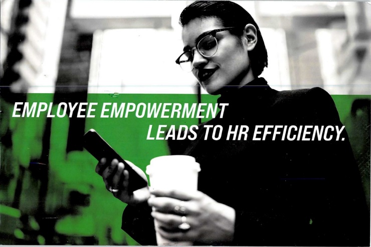
Remember how I said tech companies have to stand out in the mailbox? A single, big image and a lone headline is one way, like in this July 2020 campaign from payroll service company Paycom. The green overlay to the black-and-white picture is one of the company’s main brand colors and calls attention to the teaser.
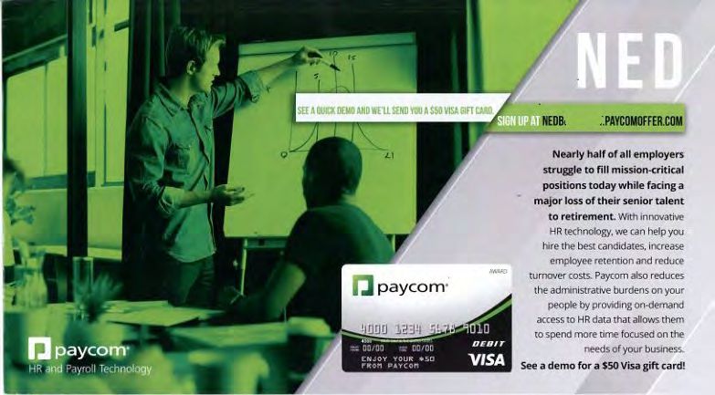
Does the brand color look familiar? Paycom used it on this 2016 postcard promoting a demo of its HR and payroll software. It offers a gift card as a premium and the call-to-action is a personalized URL (PURL).
4. LinkedIn Direct Mail
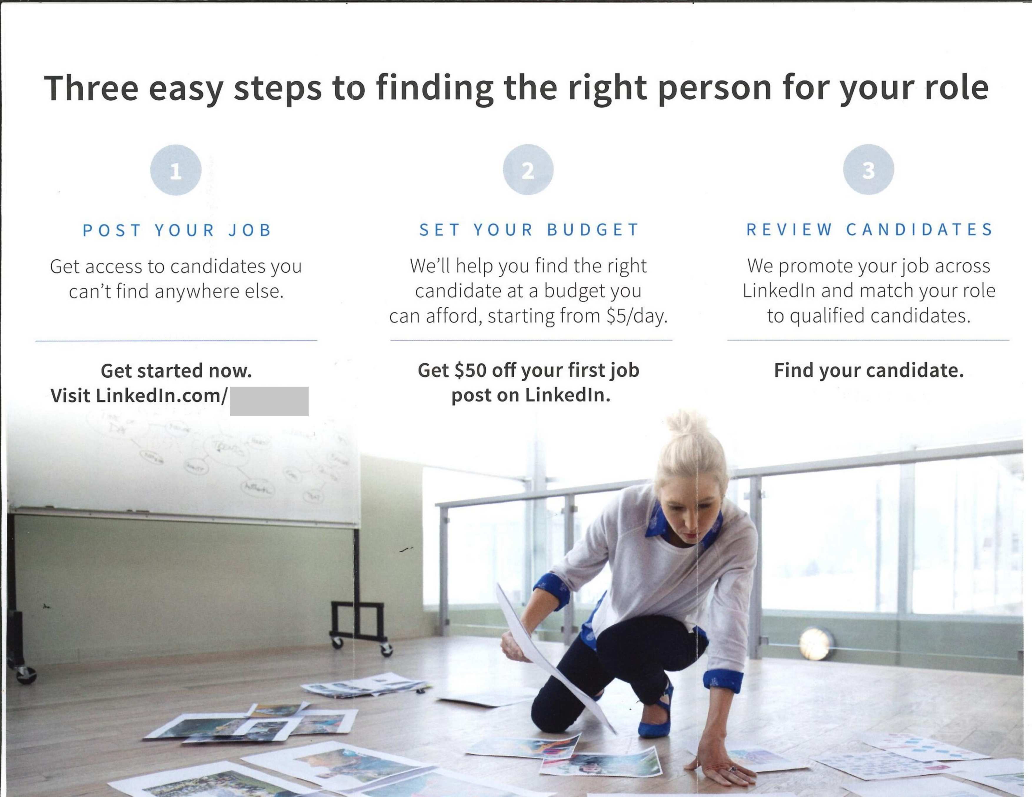
SaaS mail is often about making it as easy as possible for a customer to understand how the software works. That’s the case here, part of a tri-fold insert in this January 2020 campaign from professional networking service LinkedIn: the company adds the step-by-step process of posting a job.
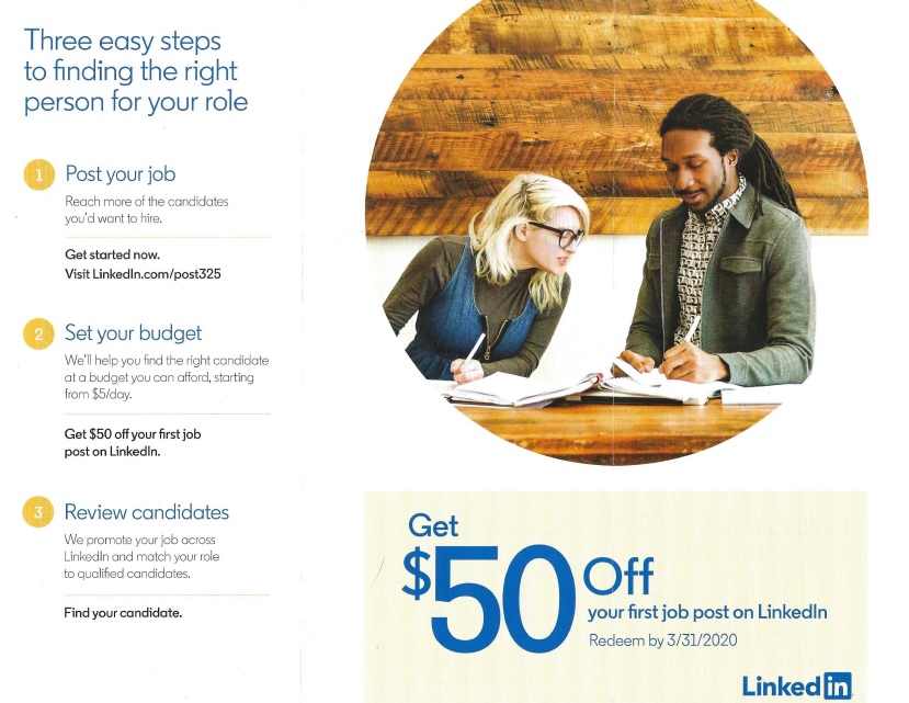
Here’s another example (below) of LinkedIn’s design strategy: images of people, step-by-step instructions, and special limited-time offers.
5. Booking.com Direct Mail
In August 2020, the travel website sent a postcard, one of the most effective direct mail formats, to its past customers with a 10% discount on the opposite side. Like the touristy postcards you see when you’re traveling, it’s only missing a “Having a wonderful time — wish you were here!” message.

6. Doordash Direct Mail
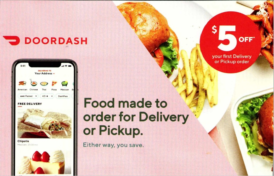
There’s an app for everything — including food delivery. And with competition from similar companies as well as restaurants themselves, Doordash mailed this postcard in October 2020. On the menu: tantalizing food images, the app itself, and a $5 discount highlighted in a big call-out.
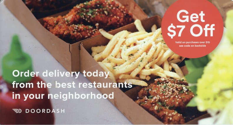
It’s an approach that’s worked well for the company, as well as other food delivery services. In 2015, this postcard (below) has all of the same elements: bright, cheery colors, food imagery, and a discount.
7. Uber Direct Mail
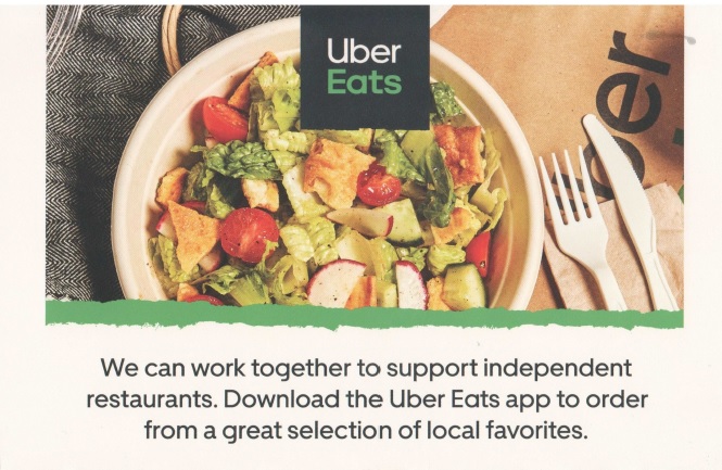
COVID-19’s impact on direct mail marketingincludes a new emphasis on supporting local brands including restaurants. In July 2020, Uber Eats mailed this effort that appeals to that impulse. For using the app, the mailer offers up to 40% off the first 2 orders. It also includes a QR code taking the customer to the website if they don’t wish to download the app beforehand.
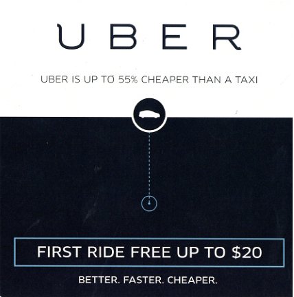
Uber has used direct mail in its marketing mix for years. For example, this postcard (below) was mailed in 2015 as it marketed its ride service (with an intro discount) in different areas of the U.S. Its design is minimalistic, with no bright colors or images, unlike the later food-oriented mailer. Whatever service it is selling, Uber is committed to the simplicity of postcards paired with a discount.
8. Gusto Direct Mail
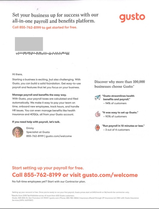
Technology mailings don’t have to be cold and impersonal, as this campaign from September 2020 shows. The small business payroll platform provider markets much like a typical SaaS company. Here, it mailed a letter, kept its argument short, and included a photo in the signature block for a personal touch. Customer survey results are in the right margin, bolstering the sales pitch.
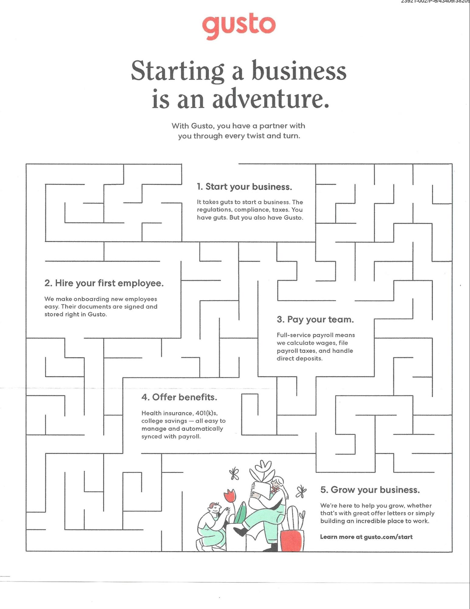
Another Gusto mailing includes a maze as an involvement device. Also using its brand colors on white background, it attracts the customer’s attention and gets them to think about the process of building their business in a different way by leading them through a labyrinth.
9. Square Direct Mail
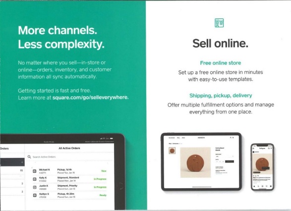
This mailing from the mobile payment provider Square was sent out in September 2020. It focuses on all of the ways a merchant can sell while using its software. Each sales channel is profiled simply with some copy and an image, surrounded by just the right amount of white space, as shown on this panel of the folded self-mailer.
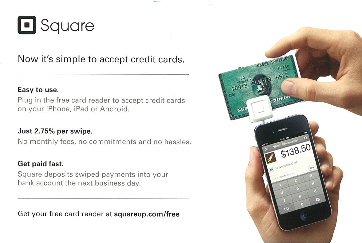
Seven years back, in one of its 2013 folded self-mailers (below), Square describes and illustrates how to use its card reader with an image and several short paragraphs.
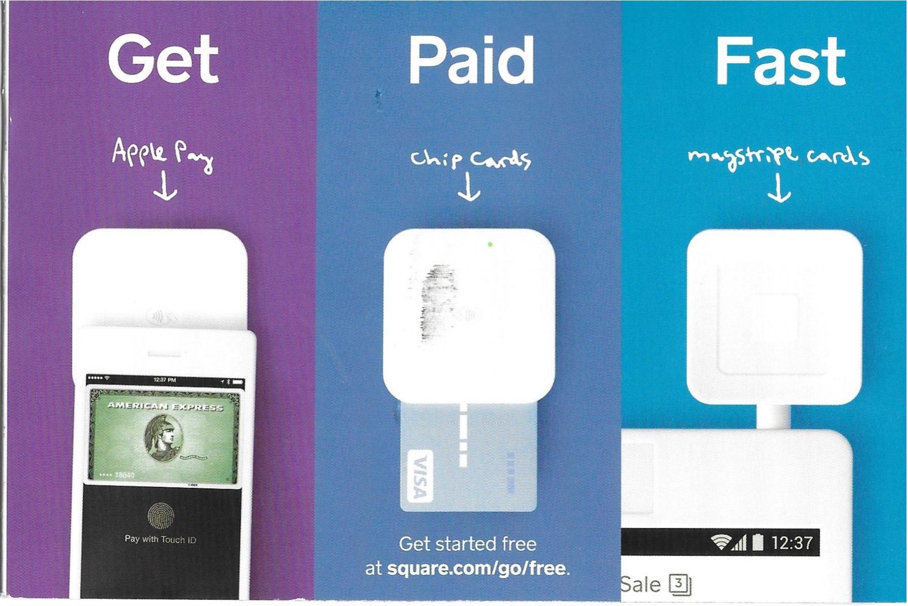
However, by January 2020, one of the benefits highlighted in 2013 was broken out and described on one side of its own self-mailer with very simple captions (Get-Paid-Fast) and images for each, as well as much more color.
10. BambooHR Direct Mail
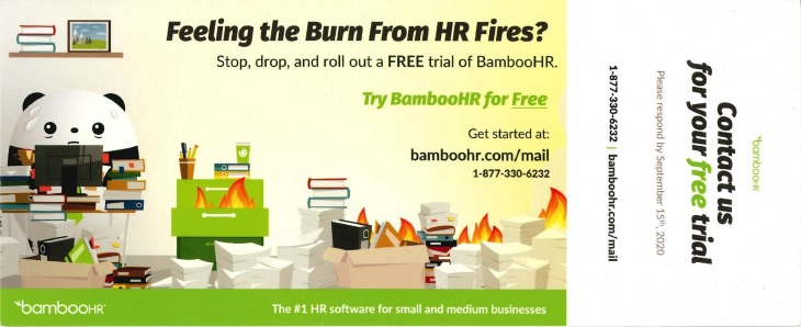
The September 2020 postcard from this HR software brand opts for a simple postcard that features its panda mascot. The offer — a free trial — stands out from the rest of the copy because it’s in green, the company’s main brand color.
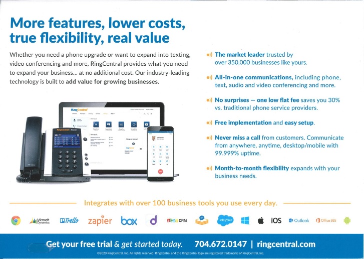
11. RingCentral Direct Mail
This provider of enterprise collaboration and cloud communications solutions mailed a 15-day free trial offer to businesses in January 2020. One of the panels on the self-mailer in this campaign ticks off the benefits of its platform, making it easy for a prospect to easily scan.
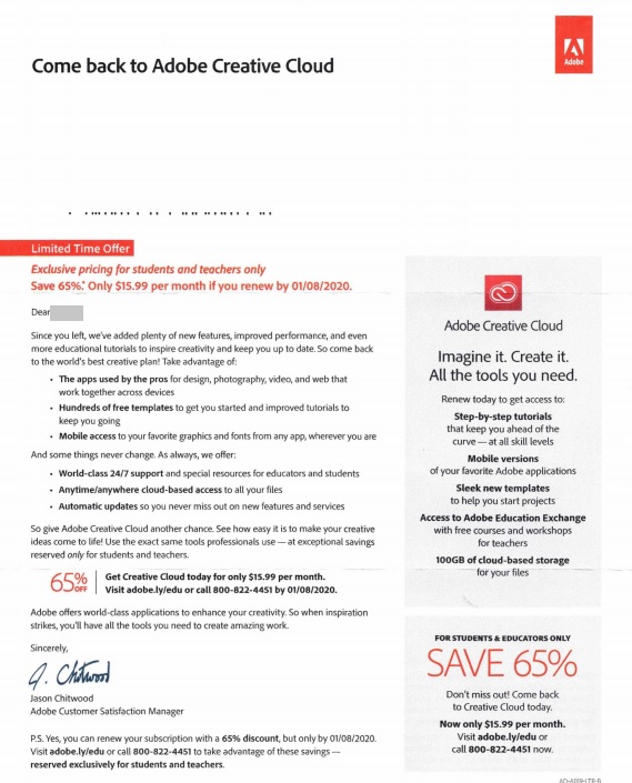
12. Adobe Direct Mail
How do you get graphic designers to renew an expired subscription? That’s a challenge met by Adobe, which mailed this letter in January 2020, reminding them of why they subscribed in the first place — and may have missed using. It also offers an exclusive price for students and teachers, showing that the company segments its data.
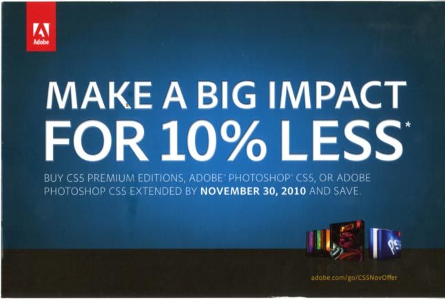
When using envelopes for the retention stage, the company sticks to another format when it comes to product promotion. Adobe boasted of helping customers to “make a big impact”. And with the very large type, this postcard uses white space very effectively in an acquisition campaign from 2010 for its Photoshop products.
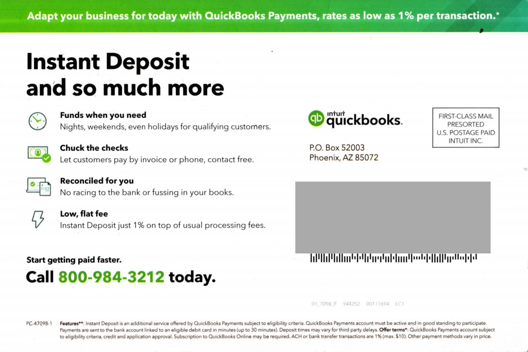
13. Intuit Direct Mail
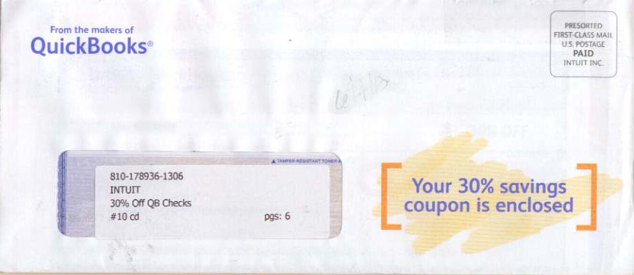
QuickBooks customers have many features available to them, including Payments. For small businesses and solopreneurs, getting paid quickly with Instant Deposit is promoted by this postcard from July 2020. The 4 main benefits are listed and set apart by icons for easy reading. What about Intuit’s earlier design decisions?
The below examples from Intuit pre-dates the consolidation of branding colors by the company. The first, from 2013, is an envelope with a coupon for 30% off QuickBooks.
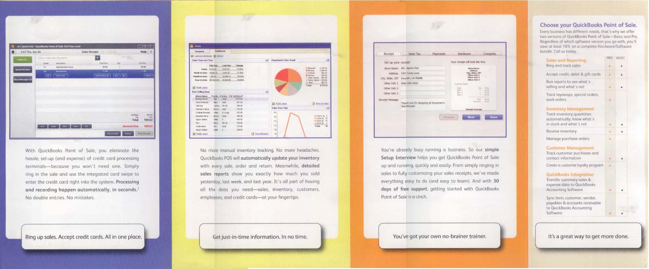
Below is one panel of a folded self-mailer from even earlier, a 2011 mailing promoting its Point of Sale software. It also reflects the company’s former use of this format and brand identity.
14. PayPal Direct Mail
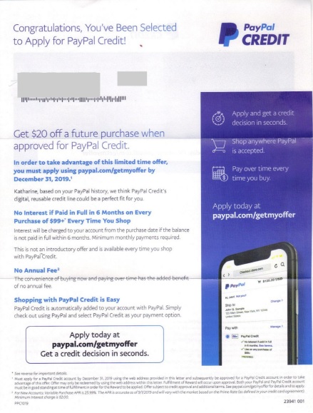
Instead of a traditional credit card, the online payment system PayPal offers a reusable credit line good for making purchases on many websites and apps. The letter here looks like most credit card direct mail acquisition efforts, but from applying to approval and fulfillment, it’s entirely on the web.
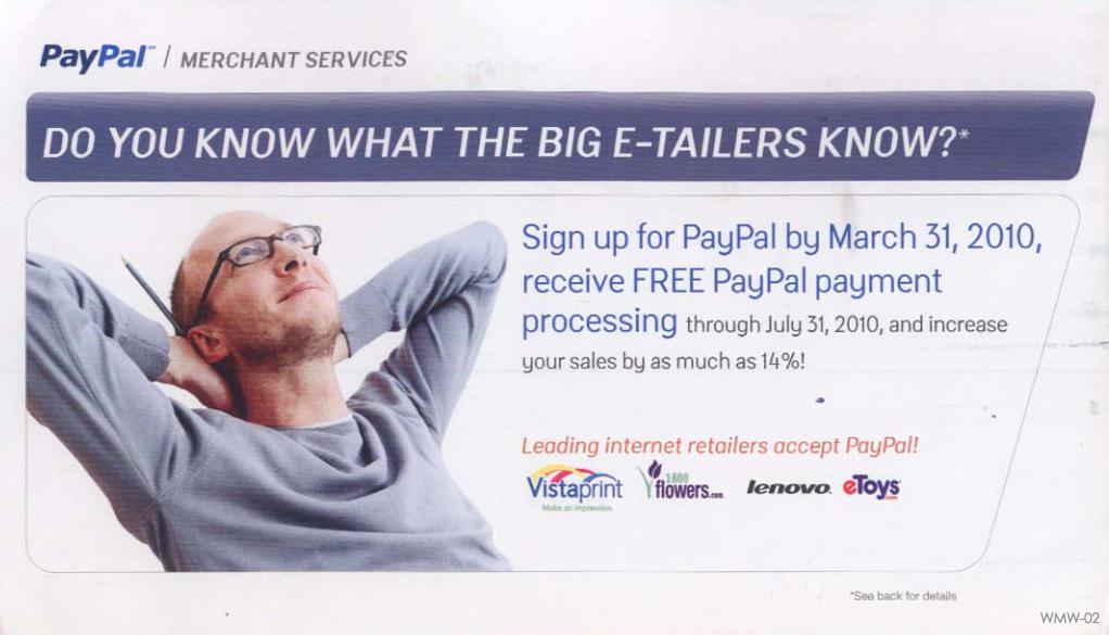
Earlier – way back in 2010 – PayPal regularly mailed postcards (below). This one has an intriguing headline, leading small businesses to compare themselves to their larger competition.
15. DonorView Direct Mail
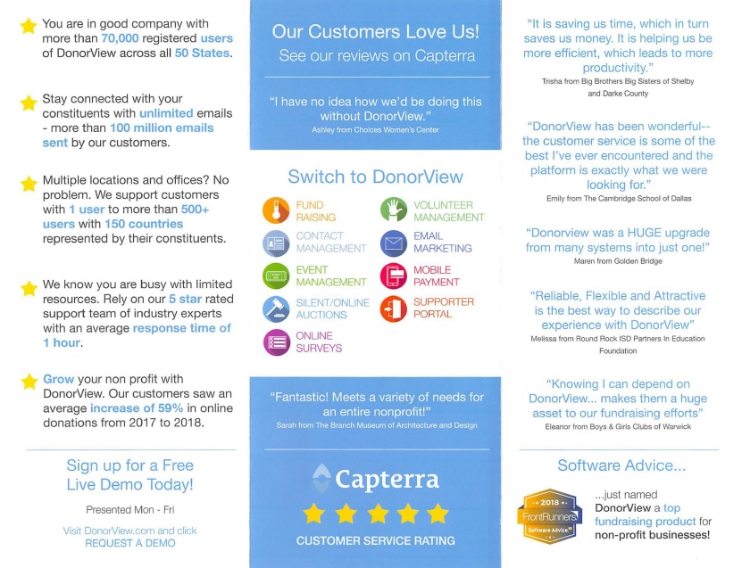
DonorView is a leading all-in-one software platform that helps nonprofits manage all aspects of their operations. This tri-fold brochure, part of a June 2020 mailing, focuses mostly on customer testimonials, ratings, as well as the number of users, and that most important figure — dollars raised.
Final Thoughts
So why do these SaaS brands use direct mail?
They know mail works. It’s tangible ink on paper, and can be sent out in different sizes, shapes, and textures. First, they know that mail can help them reach prospects who might otherwise be missed by digital channels like the web, email, or social media. Not everyone is a digital-first consumer.
Also — maybe even more important — mail stands out because it isn’t digital. Prospects and customers of all types are exposed to many messages on online channels every single day. Mail gives them a break from that. And for those people who limit their online exposure or aren’t familiar with a lot of digital-first brands, mail stands out. Current trends and best practices shown in this article can help capture your customer’s attention, and make them take action.
So the lesson here – for all those who doubt the effectiveness of direct mail in the digital age – is that mail works. Spread the word on your social media!














Steve
January 21, 2021 at 12:37 am
I like what you guys are up also. Such intelligent work and reporting!
In-House Accountant
August 19, 2024 at 12:48 am
Sending anything directly is a huge time and resource saver. We learned that through direct mail and through our choice of accounting software. We now send forms directly to the IRS/SSA with only a few simple clicks in AMS software. We haven’t missed a deadline in years.