Postcards are the simplest and most economical format you can use in direct mail marketing. And in the right hands, they can deliver the best ROI (return on investment) as well.
But knowing what to do, even for such a simple piece of mail, isn’t easy. Postcard marketing is all about focusing with laser precision on what makes this format powerful and using those features to your campaign’s advantage.
These postcard ideas will help you sharpen your direct mail campaign.
1. Focus on One Goal
Before you start, think about your strategy. Keep in mind that postcards are best when limited to a single use, instead of promoting many different offers or trying to reach multiple audiences. Put simply, you want your target to focus on one thing only.
Some examples:
- Promote a sale
- Build your brand or business, like a real estate practice
- Reward customer loyalty or show appreciation
- Remind recipient of a needed service or renewal
- Spotlight something new: a store, product or service
- Reach out to a consumer who abandoned their website shopping cart
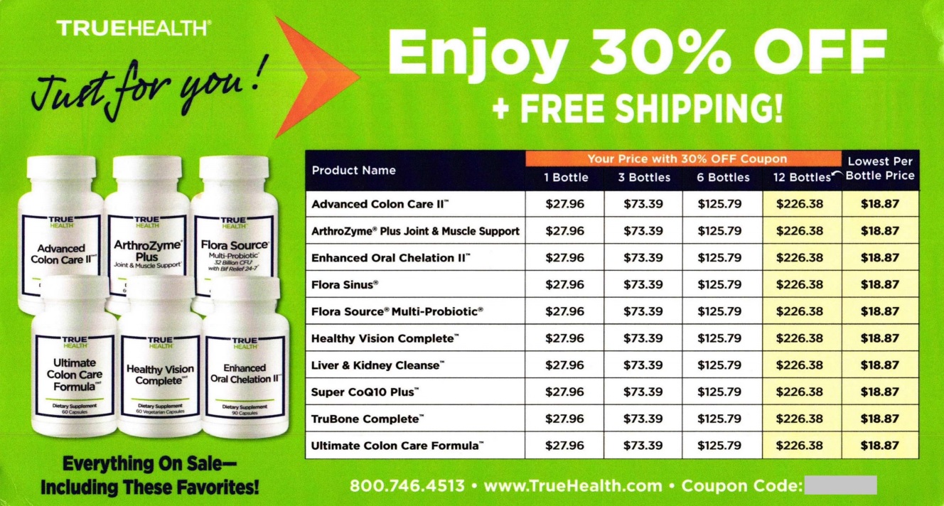
This postcard from supplement company TrueHealth has a simple but effective offer.
2. Watch Your Type and Fonts
Be smart about your postcard’s use of typography to attract the attention of customers and prospects. If their eyes are constantly adjusting to different styles, fonts, type sizes, and colors, you will lose them. Don’t get cute or flashy — just concentrate instead on making sure that your copy and graphics are legible.
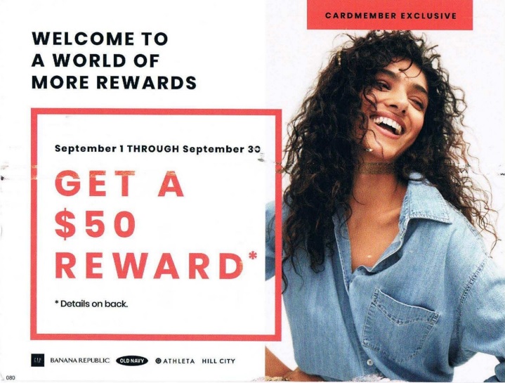
The postcard below from the apparel brand Gap shows that keeping things simple emphasizes the importance of the offer.
3. Bullet Points for Benefits
Do customers read copy? Yes, of course they do! But what makes for readable and engaging copy in a letter or brochure isn’t the same on a little old postcard.
Your postcard is meant to be quickly scanned by the customer. Make it easy for them to understand your product or service, for example, by positioning bullet points or other graphic elements.
On this postcard, auto maintenance chain Meineke describes what’s involved in one of its services by using a box graphic and bullet points.

4. Leave Some White Space
Be smart about your postcard design and don’t crowd either your headlines, copy, or visual components on the postcard. Using negative or “white” space sets certain elements of your design apart so that they’re easily noticed by your customer, like in the example below from Houston Methodist, a healthcare provider.

5. Support AIDA with Images
Let’s face it: you can be the best copywriter in the world, but on a postcard, using only words to attract the attention of a prospect will not work for many, if not most, prospects. So break it up! Give their eyes a break by using photos, graphics, or other visuals.
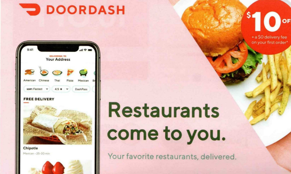
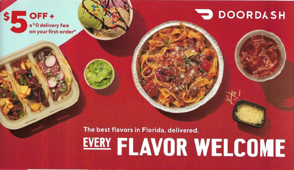
This mailer from food delivery service Doordash uses vivid photography to whet the appetite of customers, an important AIDA tactic.
6. Clear Call-to-Action
Remember how I was talking about readable type? Apply the same reasoning when you tell the customer what action you want them to take. Whatever your call-to-action (CTA) says, whether it’s:
- Call 800-XXX-XXXX by October 10!
- Go to www.[company name].com for your discount
- Come in to our COVID-19 compliant office at 123 Main St. to consult with a counselor
- Scan this QR code for your personalized offer
it must stand out from the rest of the copy, so it won’t be missed.
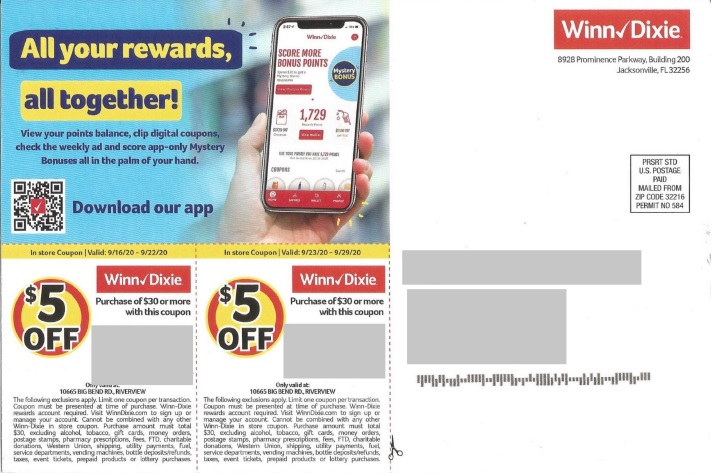
The address side of this postcard from supermarket chain Winn-Dixie mainly promotes downloading the store’s app by scanning the QR code provided. But there’s also a CTA that’s implied by the coupons included on the card.
Get an Edge by Learning from Postcards in Who’s Mailing What!
Who’s Mailing What! includes postcards from every category of direct mail. As of October 2020, the database includes 17,924 PDFs with postcard campaigns.
Here’s how to filter your search and find postcards in our database.
After logging in to the website, click on the Search option from the Dashboard.
On the left side of the page, you’ll see Direct Mail Filters as one of the options under Filters. Click on the plus sign to activate the menu, then scroll or swipe down to Format Type.
Next, click on the downward-pointing arrow at right to reveal your format choices. Simply check on the box to the left of Postcard to exclude the other formats. Finally, hit the Applied Selected Filters button to carry out the search and find many marketing postcard examples.
Final Thoughts
The postcard may be one of the best formats to carry your message. Look at the examples above and see how most of them used a strong, short headline to immediately grab the attention of the prospect and keep them hooked.
Postcards also work because you can design and produce them quickly. You’ll have smaller printing and mailing costs, so they’re perfect when you’re on a budget. Then there’s the design and copy advantages: you get just enough room to make your point quickly, and include a call-to-action that’s easy to understand — and follow.
With a combination like that, your campaign can stand out from your competition in the mailbox and move your customers to take action.


