TIPS & TRICKS
5 Simple Ways to Improve Your EDDM Postcards (with Examples)
When you want to easily reach a large group of people, EDDM postcards offer advantages other formats can’t match. Discover 5 easy ways to improve them.
When you want to easily reach a large group of people, EDDM postcards offer advantages other formats can’t match.
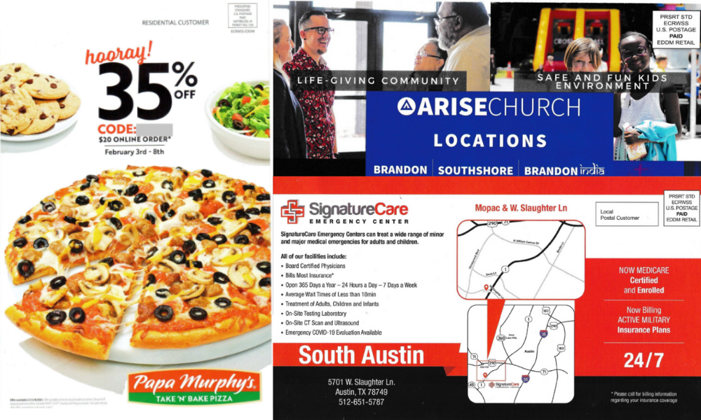
EDDM stands for Every Door Direct Mail, a U.S. Postal Service program. It’s an acronym that fits its value proposition well for companies targeting consumers for products and services that everyone — or nearly everyone — needs. EDDM was designed to work for small businesses that don’t have enormous marketing budgets. After all, even in the middle of America’s biggest cities, small and medium-sized businesses provide some of the most basic services needed and wanted by the largest number of people.
While you can blanket an entire geographic area with EDDM, you also have the option to use the free EDDM Online Tool to map your mail piece to specific zip codes, or routes or neighborhoods within them. You can even add a filter by demographics such as age, household size, or income — all from U.S. Census data.
And another attractive feature? How about postage discounts on your campaigns! As USPS Marketing Mail products, you save money with mailings of more than 200 pieces per day per zip code (for the EDDM Retail option). Larger bulk mailers can get into the act by entering an EDDM Retail bulk campaign at a USPS Business Mail Entry Unit (BMEU).
Every Door Direct Mail Examples (with Best Practices)
In practice, an EDDM postcard template looks a lot like postcards that can be much more targeted or personalized. In a previous post, we talked about winning postcard marketing ideas.
1. Highlight Your Offer
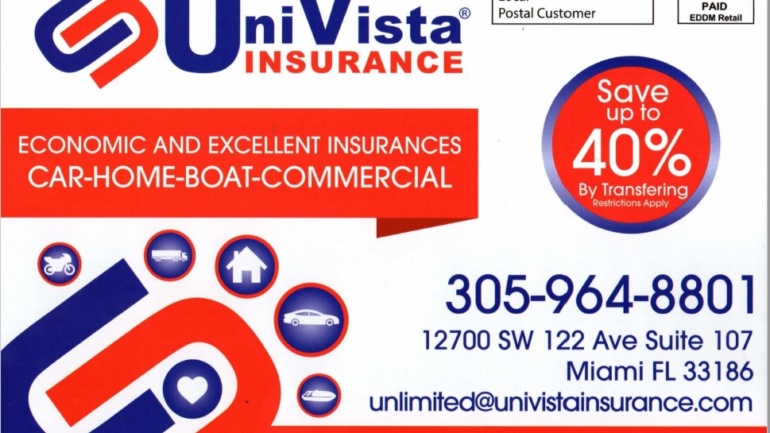
A lot of EDDM (and mail in general) floods the eyes of the recipient with too much copy, burying the offer — if there is one. But here on this postcard, Univista insurance agency mentions savings of up to 40%.
Other points:
- This EDDM postcard also lists multiple contact options, which are impossible to miss in that large type.
- The icons and short phrases quickly communicate what insurance lines are available.
2. Simplify Complex Information
Usually, postcards perform best when they’re not crowded with too much information for a recipient to read and digest. Using “white” or negative space helps people concentrate on the important elements of the campaign.
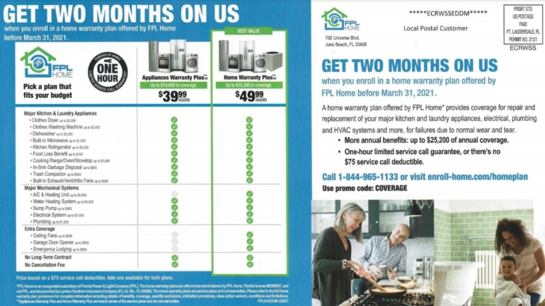
The EDDM postcard from FPL is an exception to this guideline. It sets out the differences between two home warranty plans offered by the utility using a simple chart with a checklist. At a single glance, the consumer can decide which setup works better for their needs.
Also, check out how the offer “GET TWO MONTHS ON US” is in large type and appears twice on the address side so that the customer can’t overlook it.
3. Leverage Your Endorsements
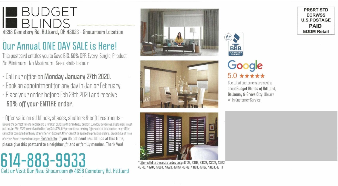
People trust other people’s opinions, especially from respected, impartial, and authoritative sources — especially when they’re local or regional. This Budget Blinds franchise puts logos from the Better Business Bureau and Google to demonstrate social proof — that the store is trusted by other consumers.
Some other interesting points:
- The offer was mailed only to select zip codes, listed on the postcard, so some segmentation is going on here.
- Although it has the showroom’s address, the call-to-action is for a phone call on one specific date to schedule an appointment.
Recommended reading: 6 Powerful Postcard Ideas You Should Try
4. Build On Local Ties
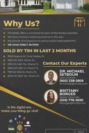
To connect with a community, it sometimes makes sense to talk about your expertise. For many professionals, it’s an important way to establish trust in an impersonal world. This real estate firm, for example, uses bullet points to talk about its staff’s years of experience and recent successes.
Two other points:
- This EDDM postcard is vertically-oriented. This format allows it to list those bullet points in a more visible way, as well as stand out in the mail.
- An additional confidence-building: logos of sites such as Trulia and Facebook among others. With a caption like “In this digital era, make your listing go viral!”, it creates the impression that a local team will use all of the tools needed to sell a client’s house.
5. Include a Map
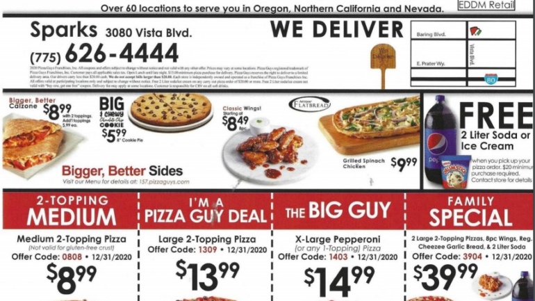
When you want people to walk in the front door of your business, it helps to show where that door is on a map. Pizza Guys, a chain of shops with dozens of locations, put a map of its nearest location to its audience on this EDDM mailer.
Other good practices include:
- Coupons, and lots of them on both sides. They extend the life of your postcard campaign.
- An easy-to-read phone number is so helpful! Even better, the franchise’s address appears on the front of the mailing, as does a QR code for placing a mobile order.
How to Find EDDM Mailings in Who’s Mailing What!
Looking for inspiration from our files when creating an EDDM postcard is easy.
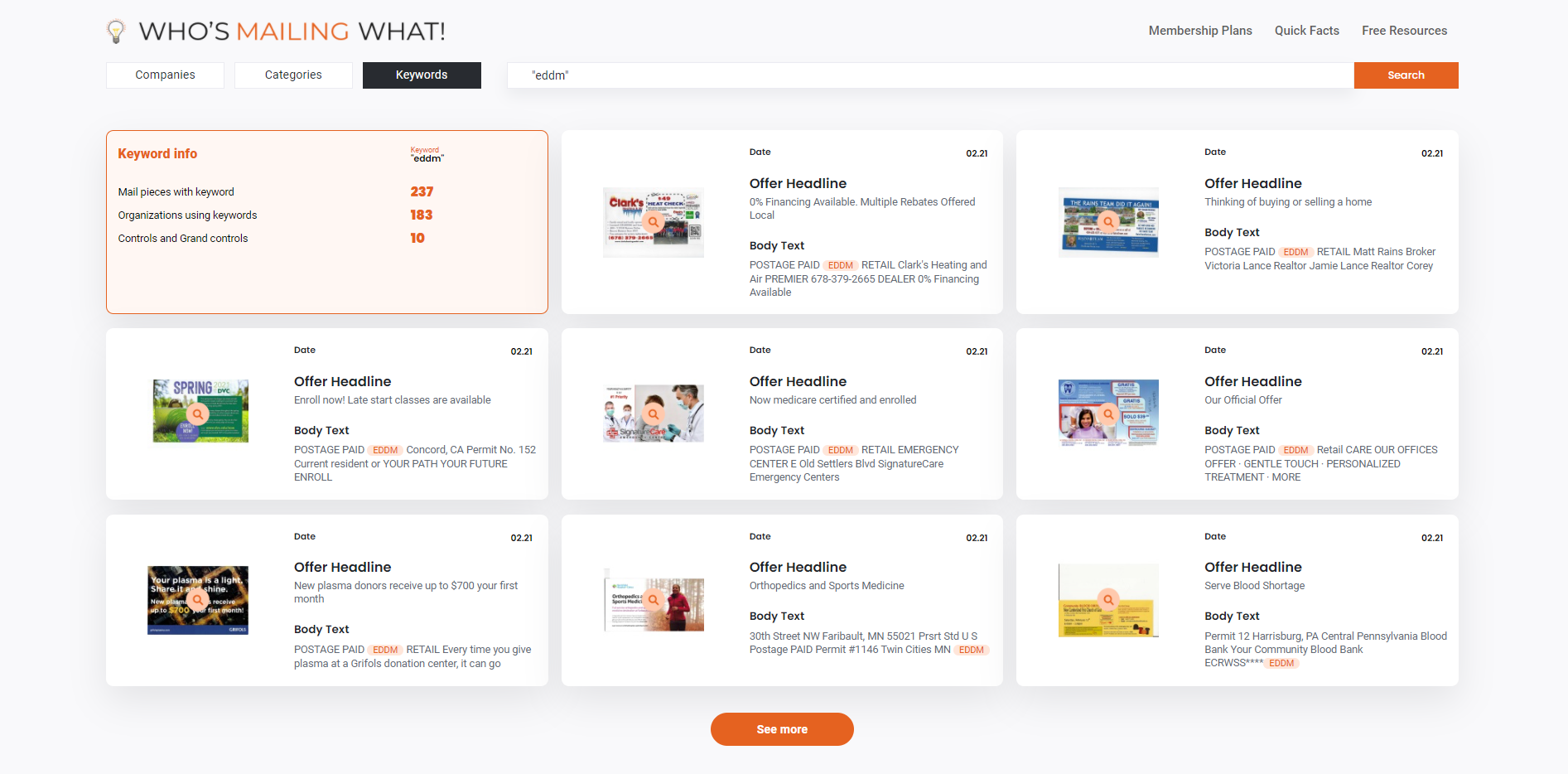
1. After logging in, you can get granular if you want and set filters for industry categories, subcategories, and geographic location.
2. Then search on the term “EDDM”.
That’s it.
You’ll get several dozen pages of results that will help demonstrate why EDDM postcards work well for:
- Real estate
- Financial services
- Restaurants
- Healthcare
- Home repair & care services
- Automotive
- Personal care services
and so many more.
3. Review the offers, copy, and design elements.
Use our free Look Up tool to search for the EDDM direct mail creatives.
Every part of your mail piece should help achieve the goal (or goals) of your campaign. When constructing an EDDM template, keep in mind the following must-have elements for producing an effective mail piece and campaign:
Big Headline — Grab the consumer’s attention immediately with a brief, bold statement about a problem you can solve, an offer, etc.
Subhead — Explain more about what you can do for the customer, enough to keep their interest and read more of the mail piece.
Single Offer — As the saying goes, if you confuse them, you’ll lose them. So resist the urge to cram too much on your postcard; focus on one goal and highlight in your copy so that it can be easily found.
A slight exception: coupons for multiple products or services gives your customer options.
Strong Visuals — Photos and graphics should be clear and uncluttered, leaving room to focus attention on your copy and call-to-action.
Contact Information — Your call to action — “visit our store at [street address]”, for example — should also be highly visible. But don’t forget phone numbers, web addresses, social media sites — they all build confidence in your company as well as provide a convenience for customers who want to connect.
Also, remember one final important point: you’re not limited to EDDM mail for ideas and inspiration. You can easily adopt copy and design practices from any postcard, like the ones found in the Who’s Mailing What! database.
Final Thoughts
As the EDDM postcard samples above showed, there is a lot you can do with a small-sized mail piece like a postcard. It is an affordable solution that you can use to reach lots of prospects easily. And you don’t even have to be a small or medium-sized company to steal smart from the practices shown here. Some larger brands — like the ones included here — recognize the value of EDDM in their marketing mix.
However, by themselves, EDDM postcards won’t help you much. They need to be part of a specific strategy — to grab attention , drive traffic (online or in-person), and create or strengthen local or regional ties that big brands often miss.
Remember to think first of your audience, make a specific call-to-action, measure your results — and, of course, act local.


