TIPS & TRICKS
Generate Response with These CTA Best Practices
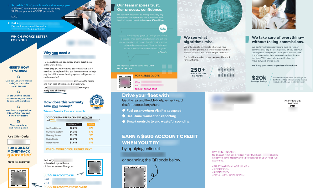
This article shares some best practices for creating effective CTAs built for response, along with examples of how some of today’s top-performing brands are leveraging CTAs to drive action.
Best-selling author and communications consultant Gary Reynolds once said, “Design matters. But design is not about decoration or ornaments. Design is about making communications as easy and clear for the viewer as possible.”
Reynolds’ statement rings especially true when you think of the creative strategy behind a direct mail campaign. Every element is written and positioned within the package to create an immediate connection and convince the prospect to move forward in the buyer journey. The call-to-action (CTA) serves as the final prompt for the recipient to act, making it the most important direct mail tactic.
A strong CTA will help increase response rates, generate leads, and drive conversions. This article shares some best practices for creating effective CTAs built for response, along with examples of how some of today’s top-performing brands are leveraging CTAs to drive action.
The Direct Mail Creative Trinity: Offer, CTA, and Deadline
Wrapping the CTA with an offer and deadline creates immediate incentive and urgency, which further increases the chance for response. Building an effective CTA statement requires a combination of strong copywriting skills, audience research, and an understanding of human psychology to influence action.
- Offers are most effective when they visually stand out, are instantly understood, and speak directly to the audience. Product or service discounts, free trials, free gifts, and bonuses are the most common offer types.
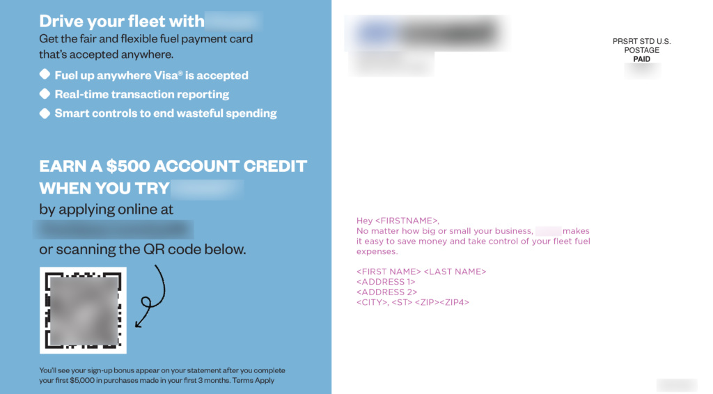
- A strong CTA starts with active words such as “get started”, “scan”, “click”, “try”, “order”, or “join” to prompt the prospect to act.
- Deadlines are often used to convey a sense of urgency and motivate the prospect to take action immediately before they forget or lose interest. Deadlines should be realistic but timely. “Limited time offer”, “Act fast”, “Don’t miss out”, or “Offer ends [date]” are great examples.
By mastering the direct mail trinity, you can create highly effective direct mail campaigns that will generate leads, drive sales, and grow your business.
Best Practices for Crafting a Compelling CTA
In a recent 2022 direct marketing industry report, marketers admitted developing engaging creative is a challenge. When selecting a new direct marketing agency, respondents noted a partner with creative expertise was a priority skill set.
Why? Because effective direct response design must strike a fine balance between creativity and motivation, copy and visuals. The best direct mail CTAs land right in the sweet spot – with an offer that is so irresistible the prospect cannot help but take immediate action. In addition to the tips shared above, use the following best practices to craft a CTA statement your audience simply cannot refuse.
1. CTA language
Use the three Cs as a guide when writing your CTA: clear, concise, and compelling. By incorporating these three elements, you can quickly explain how, and why, the reader should respond to your mailer.
Show you understand your audience by using benefits-focused copy to communicate what the recipient will gain by completing the action, such as saving money, improving their life, or experiencing something new. This can help to create a sense of excitement around the offer.
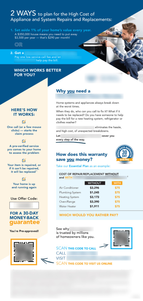
Use words before your CTA, such as “pre-approved” or “by invitation only” to help create a sense of exclusivity. Creating urgency with a specific date can also increase performance. An example of this would be, “contact us by [date]” or “offer ends [date].”
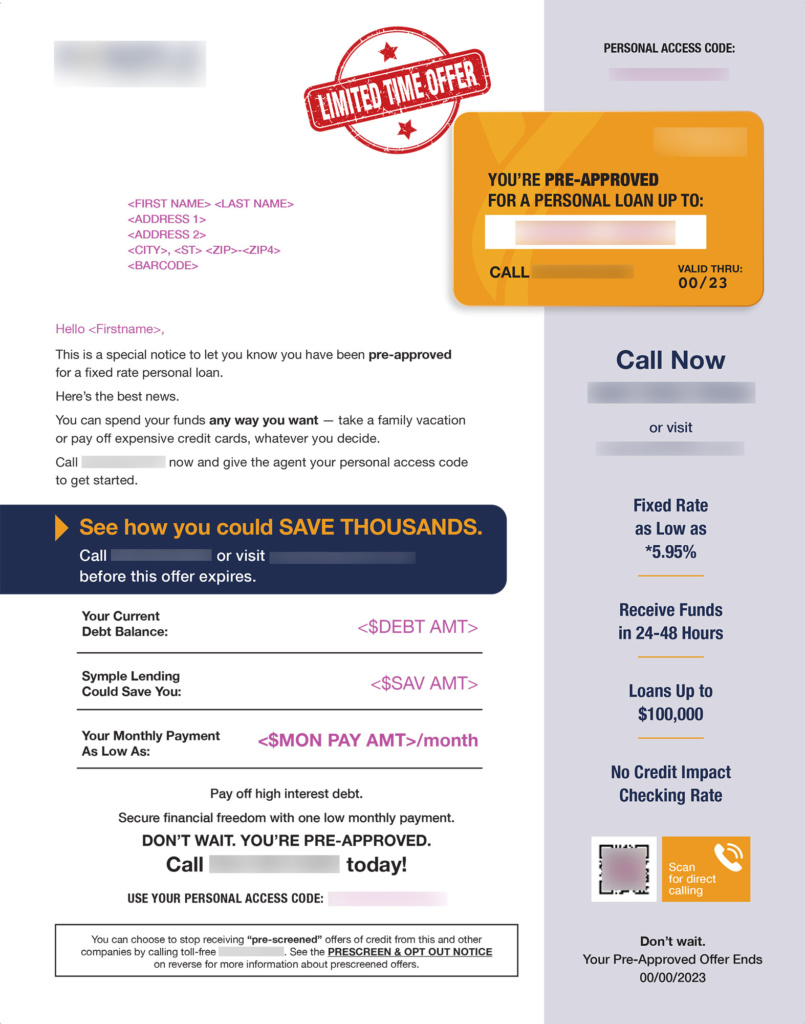
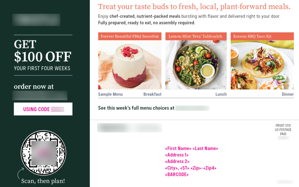
When crafting your offer, be specific to limit any confusion. Clarity is especially important if you’re offering a discount or free item. For example, if your offer just reads, “Receive your special offer,” the recipient will not know what to expect or what action to take to claim the offer. If your offer reads, “Visit our website to claim your free home quote,” you have clearly explained what the offer is and how to access it. Another strategy used to create intrigue and drive action is to say, “Scan here to see what you can save!” and include a QR code.
We’ve also found that if you’re offering a discount, including a specific dollar amount of savings will outperform packages that include a percentage of savings because consumers would rather not do the math themselves.
2. CTA placement
Most people scan print material following a “Z” or “V” pattern. Therefore, placing your CTA in these prominent locations throughout your mail piece will help to ensure it’s noticed. This strategic placement also helps create a logical flow that will guide your reader through the piece and toward the desired action. If your mail piece is larger than a postcard, your CTA should be included on both the outer and inner sides of the piece and repeated at least three times. Using bold or larger fonts can help your CTA stand out from the rest of the content.
Additionally, tucking the response vehicle, offer, offer code, and testimonials/benefit statements together simplifies the process so the reader immediately understands the value of the offer and does not need to search through the entire piece to find the information they need to act.

Another strong conversion assist is the QR code, which has become increasingly more effective. Over the past few years, QR technology has become easier to use than in the past, and more audiences are comfortable scanning QR codes due to their growing presence during the pandemic. Give QR codes a prominent position near your CTA. Use your CTA to direct your reader to online conversion, or consider an easy “scan-to-call” option.
3. CTA testing
Great direct mail packages are built on the foundation of a solid and smart testing program. Just as important as diligent list testing, ongoing testing of the CTA statement (offer, CTA, and deadline) allows you to identify the messaging that resonates with your target audience best. Over time, you can continue to refine your approach to maximize response and campaign ROI.
The most common forms of creative testing are A/B, multivariate, or a proprietary hybrid methodology. The key to accurate testing is to isolate the challenging creative variable against your control concept, such as a percentage off versus dollar off, to accurately measure impact. As a best practice, we recommend building a healthy creative testing calendar with a mix of creative deviations that are small (headline copy, imagery, or CTA) and large (complete format overhaul) based on your specific objectives. Not only will this keep your program fresh, but it will also allow you to optimize your creative strategy while managing performance risk.
These two case studies illustrate the importance of creative trinity testing:
- A fast-growing subscription wellness app tested five creative concepts to identify the best creative and offer package. The winning offer was “3 Months Free!” which achieved a positive ROI within the first month. To stay fresh with its audience, this brand continues to conduct multiple new or version creative tests every month, notably enrolling over six thousand new customers in a single mail drop.
- After conducting several creative and offer tests, a meal subscription brand identified “25% off” as the best-performing offer. This brand has flexibility in its positioning and is routinely testing its creative and messaging strategy to reach new audience segments. Even after years of testing (both offline and online), the 25% discount still reigns supreme.
To Sum Up
The design elements of a direct mail package can be the difference between a conversion and a trash bin. By following these CTA best practices and prioritizing the user experience, you can create a direct mail piece that not only looks great but will also drive results. Remember, design is not just about aesthetics – it’s about effective communication.
 Written by Tari Johnson
Tari Johnson is the Creative Director at SeQuel Response, an award-winning direct response agency based out of Minneapolis, Minn. With over 20 years of agency and in-house creative experience, Tari has a professional track record of propelling brands forward with data-driven creative strategy in both offline and online channels. You can connect with Tari at sequeldm.com, email her at tarij@sequeldm.com, or find her on LinkedIn.


