











INSPO
When Great Design Meets Great Offers
Renewal by Andersen is the latest piece featured in the Who’s Mailing What! Inspo Collection, a growing source of creative direct mail examples designed to inspire marketers, printers and agencies.

There are plenty of direct mail pieces that look good. There are fewer that make you want to open them, look at them and figure out what the deal is. This Renewal by Andersen mailer does both—which is why it caught our attention as the latest addition to the Who’s Mailing What! Inspo Collection.
The piece promotes window and door replacement, but the creative strategy goes beyond simply showing attractive homes and listing products. It uses color, format, typography, and a strong promotional offer to create a mailer that’s designed to get attention and drive action.
Color that commands attention
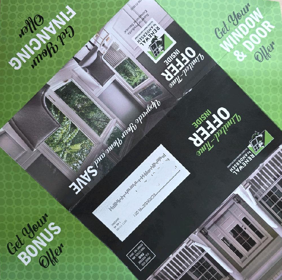
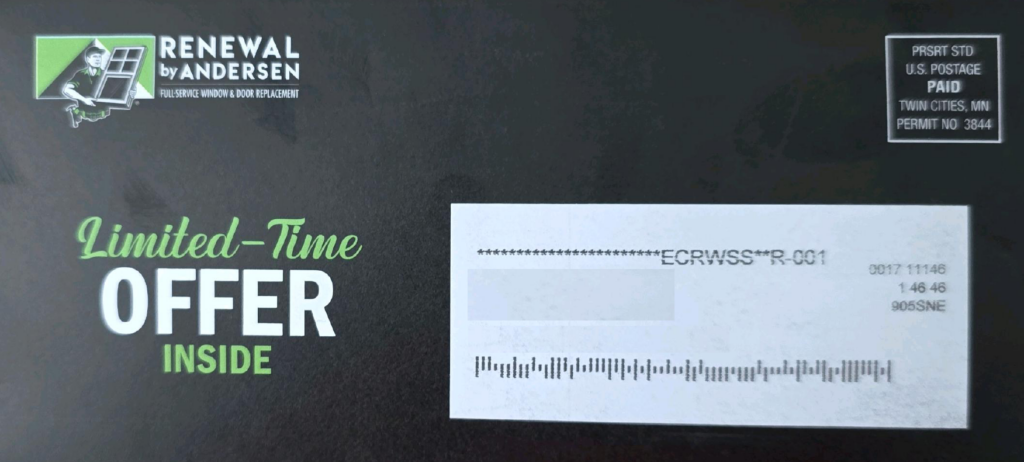
The first thing that stands out is the color palette. Black dominates the piece, with bright lime green and white used strategically to create contrast. Rather than throwing a rainbow of colors onto the page, the designers have limited the palette and used it to establish a clear hierarchy. The result is hard to miss.
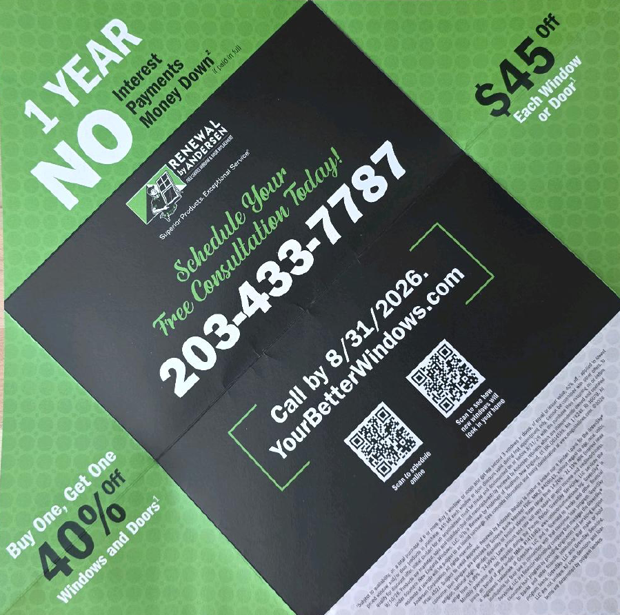
The largest messages—”Limited-Time Offer Inside,” “$45 Off” and “40% Off”—jump off the page. The green becomes a visual signal for the promotion, while the black gives the mailer a polished, almost premium feel. For direct marketers, that’s a good reminder that more color doesn’t necessarily mean more attention. Sometimes fewer colors, used more deliberately, work harder.
A format that encourages exploration
The physical format is another reason this piece works. The recipient isn’t handed the entire message on the first panel. The cover creates curiosity with “Limited-Time Offer Inside,” encouraging the recipient to open the mailer and see what’s waiting.
Once opened, the design expands into large product photographs, promotional messaging and additional offers. It’s a small but important advantage of direct mail: the format itself can become part of the creative. Instead of designing a flat advertisement and putting it into the mail, marketers can think about the physical journey—from mailbox to hand to opening to response.
A very clear value proposition
And then there’s the offer. The mailer doesn’t make the recipient hunt for the deal. It prominently promotes several incentives, including $45 off each window or door, a buy-one-get-one offer of 40% off, and financing language featuring one year with no interest and no money down. That’s a lot of reasons to keep reading.
Just as importantly, the piece includes a deadline, giving the recipient a reason to act now rather than putting the project off for another six months. For products that require consideration—like home improvements—that sense of urgency can be especially important.
The imagery shows the “after”
The photography is also doing more than demonstrating the product. The windows and doors are shown within attractive homes, helping the recipient visualize the finished result. That’s a subtle but important difference. The customer isn’t buying a window. They’re buying a better-looking home, more natural light, a refreshed space and the feeling that their house has been upgraded. Showing the product in context helps make that future state easier to imagine.
Multiple ways to respond
The call to action is another strength. The piece tells recipients to schedule a free consultation, then gives them several ways to do it: phone, website and QR code. There’s also a separate QR code offering an interactive way to see how the windows could look in a home. That’s a smart use of the physical-to-digital connection. The mailer isn’t trying to force everyone into the same response channel.
Call. Scan. Visit the website. Explore. The recipient gets choices.
What other direct marketers can take from it
You don’t have to sell windows and doors—or have a giant national brand—to borrow ideas from this mailer. The biggest takeaway is that every element has a job.
The color gets attention.
The typography establishes hierarchy.
The format creates curiosity.
The photography shows the desired outcome.
The offer creates value.
The deadline creates urgency.
And the multiple response options make it easy to take the next step.
That’s the kind of direct mail worth studying—not because another marketer should copy the design exactly, but because it demonstrates how creative decisions can work together toward a single objective.
Beautiful direct mail is nice. Beautiful direct mail that makes you want to do something is better.